Flood disadvantaged neighbourhoods of particular concern will include those where socio-spatial vulnerability, exposure and disadvantage are all extremely high relative to other English neighbourhoods (i.e. neighborhoods which are extremely high or acute in the map categories for all of the three top-level maps shown with a bold outline in Figure 1).
Examples of the maps
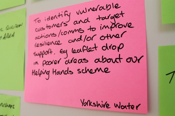
User feedback Birmingham Climate Just event, Jan 2014 © Climate UK
To demonstrate how to interpret the maps in a local authority context, selected examples are provided below of the various maps that can be produced from the downloaded data.
On this page:
The maps can be used to provide an overview of social vulnerability and climate disadvantage across a local authority area (and to compare this to the national average – see Box 2 and Box 3). The maps can also be used to provide more detail about the characteristics of particular areas, in terms of indicators of the individual, social and environmental factors which explain vulnerability. In turn, this helps to understand the ways in which particular people and communities might be negatively affected by events like floods and heatwaves, and therefore what measures might be most appropriate to help build local resilience.
Flood disadvantaged neighbourhoods of particular concern will include those where socio-spatial vulnerability, exposure and disadvantage are all extremely high relative to other English neighbourhoods (i.e. neighborhoods which are extremely high or acute in the map categories for all of the three top-level maps shown with a bold outline in Figure 1).
|
Box 2: Understanding how the maps are presented
Note: see Box 3 for the SFRI
All data used to generate the maps in the map tool have been standardised before being combined. The standardisation process produced a set of scores which placed data for each local area in the wider geographical context. In the case of the NFVI, this was the UK average (UK mean), while in the case of the heat-related data, this was the English average (English mean). As a result local characteristics can be compared to a wider benchmark to determine how far they are similar to, higher or lower than average. The scores for the NFVI and heat-related data use the classification scheme shown in the Table below.
|
Scores
|
Label
|
|
≥ 2.5
|
Acute
|
|
1.5 – 2.5
|
Extremely high
|
|
0.5 – 1.5
|
Relatively high
|
|
-0.5 – 0.5
|
Average
|
|
-1.5 - -0.5
|
Relatively low
|
|
-2.5 - - 1.5
|
Extremely low
|
|
≤ - 2.5
|
Slight
|
This standardisation was also important to allow the combination of data into composite maps. Since there are different numbers of indicators and domains, they have undergone a weighting process. This has given an equal weighting to all indicators, domains and dimensions. More information can be found in the Technical User Guide. If required, local data analysts should also be able to reconstruct the index at a finer scale or recalculate scores in response to specific needs, e.g.
-
To show scores relative to other geographical contexts, e.g. at county level
-
To consider differences in the local importance of particular themes, e.g. to make sensitivity have a bigger influence on the final composite social vulnerability scores.
-
To add or remove indicators, e.g. to account for local data or priorities
|
|
Box 3: Understanding how the maps are presented
Note: see Box 2 for the NFVI and all heat-related data
The SFRI uses a different final classification scheme to the one outlined in Box 2 because the standardised measure of social vulnerability represented in the NFVI is combined with a measure of flood hazard (likelihood of flooding) and an estimate of the numbers of people exposed. The result is a relative index which has no defined units. The scores for the SFRI use the classification scheme shown in the Table below.
|
Index score
|
Label
|
|
0
|
No exposed population
|
|
<0
|
Exposed, NFVI below the UK mean
|
|
>0 to +5
|
Low
|
|
+5 to +12.5
|
Moderate
|
|
+12.5 to +25
|
High
|
|
+25 to +50
|
Very high
|
|
+50 to +100
|
Acute
|
|
>100
|
Extreme
|
In the SFRI scheme the higher the score for a neighbourhood, the higher the level of social flood risk. High levels of risk occur where high numbers of people live in the floodplain in a neighbourhood with high social vulnerability. Any area with a positive score is of concern for social flood risk, even where that risk is shown as ’low’.
High negative values are a result of high numbers of people living in the floodplain in a neighbourhood with low social vulnerability, i.e. below the UK mean. It is important to recognise that neighbourhoods with negative scores represent places where people are exposed to flooding. The distinction is that the people exposed to flooding live in neighbourhoods where overall social vulnerability is relatively low for the UK as a whole, on average. It is important to recognise that there could be smaller areas of flood disadvantage within these areas or specific risk associated with one or more characteristics of vulnerability (e.g. sensitivity).
Finally neighbourhoods where no-one lives in the floodplain have a value of zero. The number of these neighbourhoods with no exposed populations is larger for fluvial coastal flooding than for surface water flooding. See the Technical User Guide for more information.
|
Figure 2.1 provides an overview of the Social Flood Risk Index results for river and coastal flooding:
-
Present Day Group (population weighted)
-
2 degrees future scenario Group (population weighted)
-
2 degrees future scenario Group (population weighted)
-
Present Day Individual (per person average)
-
2 degrees future scenario Individual (per person average)
-
2 degrees future scenario Individual (per person average)
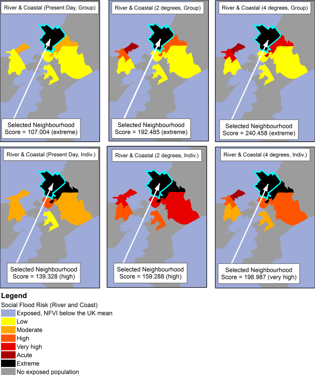
Figure 2.1: Flood disadvantage according to the Social Flood Risk Index (river & coastal flooding).
The area shown in Figure 2.1 has neighbourhoods which are estimated to have a mix of levels of flood disadvantage. It includes neighbourhoods which are estimated to have no residents who are exposed to river and coastal flooding (grey). It also includes neighbourhoods where residents are exposed to river and coastal flooding but those neighbourhoods are also below the UK mean for overall social vulnerability, according to the NFVI metric (light blue). All other areas have social flood risk, ranging from low (yellow) through to extreme (black). All of the areas coloured yellow through red to black are of particular concern but with increasing concern from yellow to black.
The selected neighbourhood (cyan highlighting and denoted with the arrow) is extremely flood disadvantaged in all scenarios and in relation to group (population) and individual (‘per person’ average) measures. The high positive score for the group measure results from the combination of the likelihood of flooding, the number of people estimated to be affected and the overall social vulnerability of the neighbourhood, according to the NFVI. The individual measure controls for the number of people by dividing by the number of people estimated to be affected to give a ‘per person’ average.
Figure 2.2 provides an overview of the Social Flood Risk Index results for surface water flooding:
• Present Day Group (population weighted)
• 2 degrees future scenario Group (population weighted)
• 2 degrees future scenario Group (population weighted)
• Present Day Individual (per person average)
• 2 degrees future scenario Individual (per person average)
• 2 degrees future scenario Individual (per person average)
The area shown in Figure 2.2 also has neighbourhoods which are estimated to have a mix of levels of flood disadvantage. In this case there are no unexposed neighbourhoods, i.e. where residents are estimated to be exposed to surface water flooding (no grey neighbourhoods). As with river and coastal flooding, it also includes neighbourhoods where residents are exposed to flooding but not estimated to have social flood risk, i.e. the neighbourhoods are below the UK mean for overall social vulnerability, according to the NFVI metric (light blue).
All other areas have social flood risk, ranging from very high (red) through to acute (dark red) and extreme (black). The selected neighbourhood (cyan highlighting and denoted with the arrow) is extremely flood disadvantaged in all scenarios on the group measure and relatively high (orange) or very high (red) in relation to the individual (‘per person’ average) measure. As before, the high positive score for the group measure results from the combination of the likelihood of flooding, the number of people estimated to be affected and the overall social vulnerability of the neighbourhood, according to the NFVI. Again, the individual measure controls for the number of people by dividing by the number of people estimated to be affected to give a ‘per person’ average.
It is worth remembering that both the river/coastal and surface water SFRI is constructed from the same NFVI score. In other words, the social vulnerability shown by the NFVI is the same for both river/coastal and surface water flooding. Therefore, if a neighbourhood has any exposed residents then the NFVI determines whether a score is positive or negative. If a neighbourhood has exposed residents then it will be shown as either positive (social flood risk) or negative (no social flood risk) for both river/coastal and surface water flooding. It cannot be negative (no social flood risk) for fluvial/coastal and positive (social flood risk) for surface water flooding.
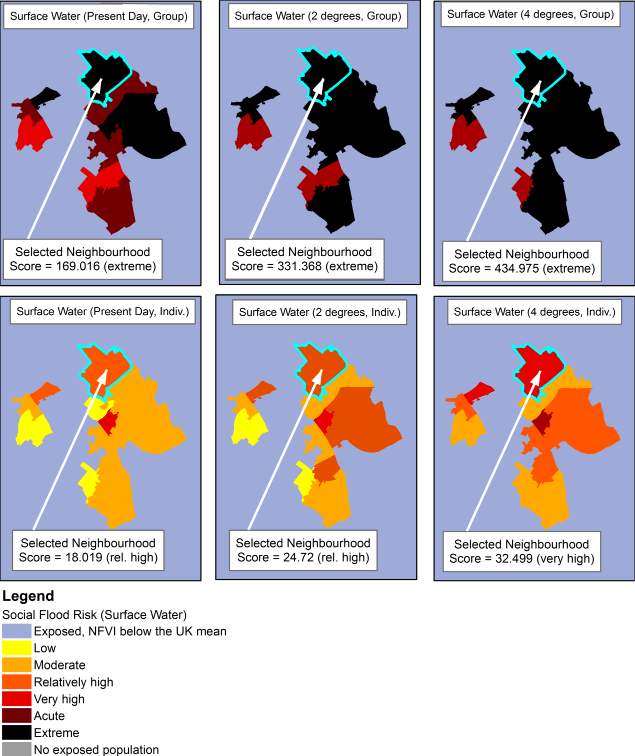
Figure 2.2: Flood disadvantage according to the Social Flood Risk Index (surface water flooding).
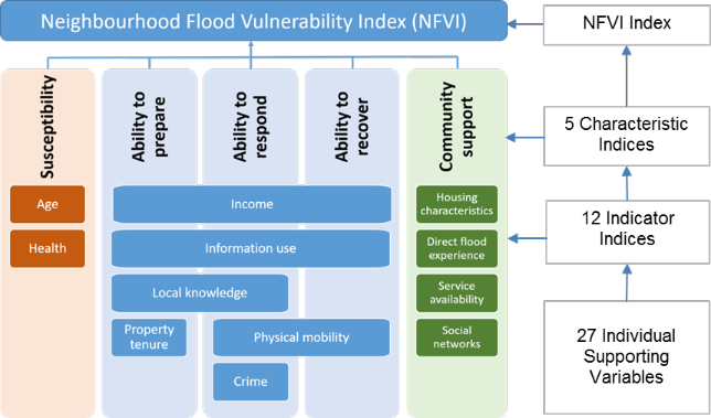
Figure 2.3 shows that the selected neighbourhood has above average scores for all elements of social vulnerability to flooding according to the NFVI. However, the community support and susceptibility characteristics fall within the ‘average’ (light yellow) mapping category as the values fall within the -0.5 to +0.5 range used for mapping. The graph in Figure 2.3 shows that the community support score is only just above average but the susceptibility characteristic is closer to the boundary of the relatively high category (+0.5 to +1.5, see Box 2).
The highlighted neighbourhood is a particular concern in relation to the ability to prepare, respond and recover characteristics, i.e. in terms of the potential adaptive capacity of its residents.
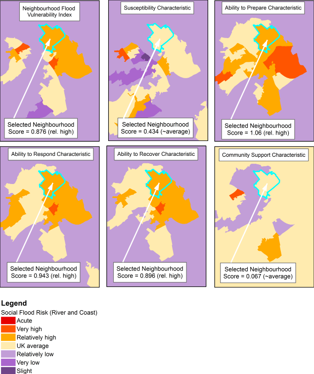
Figure 2.3: Social flood vulnerability according to the Neighbourhood Flood Vulnerability Index and its five characteristics in map and chart form.
Figure 2.4 presents charts of the compound indicators from which the NVFI is constructed. It shows which personal and social factors are highest and lowest and therefore provides an insight into the causes of the scores seen in Figure 2.3.
From Figure 2.4 (top) the graph shows that although the susceptibility score as a whole is in the ‘UK average’ category, the ‘age’ indicator score is relatively high. Further examination of the supporting variables shows that the neighbourhood is associated with a larger proportion of young children (<5 years of age) than is usual for the UK as a whole (8.8% compared to 6.1%). More information about why this is an issue and what can be done in response is available in the main Climate Just resource in our dedicated message about young children and vulnerability to flooding and heat related hazards. This example underlines the value of exploring the underlying data in detail.
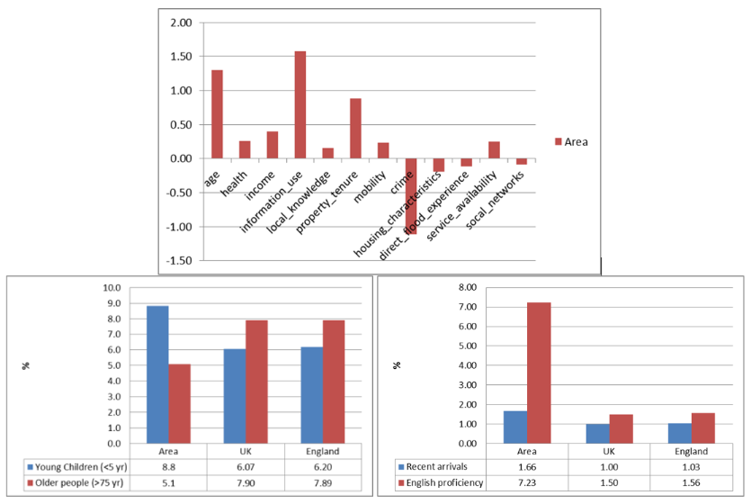
Figure 2.4: Social flood vulnerability indicators (top) for the neighbourhood area highlighted in Figures 2.1-2.3 with a breakdown of the supporting variable data for the age (bottom left) and information use (bottom right) indicators.
The largest scoring indicator from Figure 2.4 (top) is the one relating to information use. The most marked supporting variable is the tendency for residents in this neighbourhood to have difficulties with English proficiency, 7.2% compared to only 1.5% on average for the UK. Residents in this neighbourhood may therefore have difficulties accessing and using information on flood risk and be less able to prepare, respond and recover as a result. More information about why is available in the main Climate Just resource.
Other indicators which contribute to higher social vulnerability include property tenure and income. Both of these indicators affect the ability of residents to prepare for flood events (the highest scoring vulnerability characteristic for this neighbourhood). The detailed data should also be reviewed using individual supporting variables for this neighbourhood.
To complete the picture of this neighbourhood, it is worth considering neighbourhood characteristics which act to offset some of its vulnerability. Residents in this neighbourhood do have the advantage of living in an area of relatively low crime so that they are more likely to feel able to deploy property protection measures such as flood gates, even if aware from home. Other indicators which are below average – although only marginally - include housing characteristics (lower proportions of housing types very likely to be damaged), flood experience (some in the community are likely to be aware of past flooding events) and social networks (therefore opportunities for community information sharing may be slightly better than on average in UK neighbourhoods).
Different neighbourhoods across the UK can have very different profiles in terms of what contributes to social vulnerability and disadvantage. A detailed review of data behind the maps is always recommended. This helps to identify which areas of the main Climate Just site are likely to be particularly useful for producing evidence and actions for a local case study.
This example looks at working with heat disadvantage and socio-spatial heat vulnerability data. It uses the data to identify an area of extremely high heat disadvantage in relation to the distribution of mean summer maximum temperatures in the 2050s (Figure 4.1 (d)). Figure 4.1(b) shows population weighted socio-spatial heat vulnerability data with Figure 4.1(a) showing the neighbourhood level socio-spatial heat vulnerability data behind it (Figure 4.1(a)).
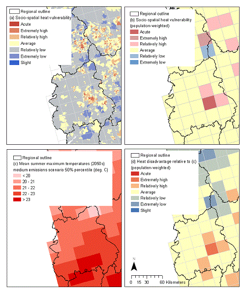
Figure 4.1 (a) Socio-spatial heat vulnerability by neighbourhood, (b) expressed as a population-weighted total, (c) heat hazard-exposure measured as the medium emissions scenario 50% percentile mean summer temperatures in the 2050s and (d) heat disadvantage relative to (c)
Figure 4.2 shows the components of socio-spatial vulnerability in 2011 for part of the area identified as relatively disadvantaged in Figure 4.1. The highlighted neighbourhood scores above average for all components of socio-spatial vulnerability in 2011, although this is less marked in terms of enhanced exposure (how far the local neighbourhood environment is likely to exacerbate the effects of heat). This contrasts with the neighbourhood immediately to the north, where there is below average sensitivity but a much higher than average enhanced exposure. For example in that neighbourhood, 9.7% of households live in homes at or above the 5th floor of a building compared with 0.7% on average (based on 2001 data).
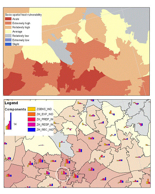
Figure 4.2 (top) Socio-spatial heat vulnerability by neighbourhood (2011), (bottom) components of socio-spatial heat vulnerability: sensitivity (ZSENS_IND); enhanced exposure (ZH_EXP_IND); (in)ability to prepare (ZH_PREP_IN); (in)ability to respond (ZH_RESP_IN); and (in)ability to recover (ZH_REC_IND).
The white circle indicates a neighbourhood which is explored in further detail.
The people in the neighbourhood highlighted with the white circle tend to have:
-
Higher sensitivity. This is particularly affected by a disproportionately laqrge proportion of children under 5 (8.5% compared to 6.2%). There is also a higher than average proportion of people (27.3% compared to 17.8%) who have a long-term illness or disability which affects their day-to-day activities a little or a lot. The proportion of older people (aged 75 years or older) is just below average (6.8% compared to 7.9%).
-
Lower adaptive capacity. The neighbourhood is associated with low average incomes (estimated average household weekly income of £210 compared to £424 in the average English neighbourhood, after accounting for differences in housing costs). There are very high proportions of people who are unemployed, long term unemployed or who have never worked. A very high proportion of people live in homes rented from social landlords (around 68% compared to 17.5%). Low incomes and renting rather than owning homes restricts people’s ability to modify homes. However, although being very built up, the area does benefit from having a lower than average proportion of people living in high-rise accommodation (0.3% compared to 0.7%). There is also an opportunity for social landlords to assist with adaptation. A high proportion of people were born outside the UK and Ireland here may indicate the need for information to be provided in other languages. Depending on the composition of the population, it may also mean that there is some community knowledge about coping with high temperatures. However, effective action depends on there being no other barriers to applying knowledge, such as the nature of the building stock.
This summary has extracted a subset of some the indicators with particularly high values from the socio-spatial vulnerability index. The final example develops a pen picture with a wider selection of indicators and connects this to some potential adaptation measures. Further suggestions on possible measures can be found in other parts of the website.
Example 3 shows how a more detailed pen picture can be developed for particular areas of interest and connected to potential actions. It is developed simply from consulting the underlying indicators behind the socio-spatial vulnerability data. The case study is taken for a neighbourhood which was ranked within the top 1% of the most socially heat vulnerable neighbourhoods in England in 2001.
The case-study neighbourhood had above average scores in all of the dimensions of socio-spatial heat vulnerability considered in the 2001 version of the index.
It had a particularly high enhanced exposure score which contributed to the high overall score. This is because the neighbourhood had a disproportionate amount of high-rise accommodation compared to other neighbourhoods in England. Some 28% of households had a lowest floor level at fifth floor or above, compared to just 1% for England as a whole. Many of the most heat vulnerable neighbourhoods may similarly be associated with high-rise living. This is an extremely important driver of differential impacts between communities.
Another notable concern is the low proportion of garden space available. In the case-study there was 56% less private garden space than in an average English neighbourhood.
There were proportionally fewer young children than the national mean, and also fewer older people, so the area did not have a highly sensitive population in terms of age. However, local residents were more likely to report a limiting long-term illness - around 30% compared to 18% in the average English neighbourhood. This tendency to report poor health, coupled with a lack of private outdoor space and high-rise living all contribute to potential negative effects from extreme heat on people in this neighbourhood.
To understand further the extent of socio-spatial vulnerability, it is important to consider what adaptation resources, both tangible and more intangible, may be found in the neighbourhood. The area had an above-average proportion of social tenants (11% compared to 6%) but just below average private renters. So although many residents may have some restrictions in adapting their personal environments, social landlords could have a role to assist if appropriate resources were available. Indeed, this could be a very effective and efficient way of reaching the most highly sensitive communities. Otherwise, another factor which might restrict autonomous adaptation would also come into play – that of low income. In this particular community, people were unlikely to have a large amount of disposable income once the basic necessities of their day-to-day lives had been covered. They lived on very low average incomes; just £240 per week, compared to £390 for the average English neighbourhood (accounting for different housing costs). These factors all suggested the potential for a lack of preparedness in this particular area.
The people in this neighbourhood were also challenged in terms of their ability to respond both due to the physical environment and social factors. To avoid heat stress it is important that people within a community with these characteristics know how to keep cool, that they are able to act on this knowledge and that they support neighbours, particularly people who are old or in ill-health, as these groups are susceptible to harm from high temperatures. However, a number of indicators suggest that social networks were not likely to be as strong as elsewhere in the country. For example, there was a higher proportion of single-pensioner households (20% compared to 14%). Other potentially isolated groups were also larger than in the average English neighbourhood. The percentage of lone parents with dependent children was 9% (compared to 6% across the country as a whole). The area was also associated with general population loss on the one hand but a relatively high rate of overseas arrivals on the other. While the latter may have come from areas where they are personally used to high temperatures, their recent arrival may mean that they are less well integrated. The two factors together therefore suggest a level of community transience which could be an indicator of rather weak social networks which may inhibit responses.
While the area had a higher than average loss of business units, it had a retail density which was around the English norm. It is therefore possible that agreements could be made with local businesses, which may offer a cool environment for the community to use during a heatwave. Indeed, this could be achieved through using other public spaces for this purpose, such as libraries. This sort of strategy is used in cities across Europe where heatwave planning is particularly advanced, such as in Greece. Here there are agreements with hotels and other places with air conditioning to provide cool refuges for people within the community.
However, to make use of this sort of strategy, people need to feel secure in their communities in the first place. For this particular neighbourhood, the much higher crime rates compared to the rest of the country may make some feel more inclined to stay at home. Given that many heatwave deaths are associated with temperatures at night, this may also impact on people’s capacity to act on advice to leave their windows open. High-rise living may actually be a benefit in this context, although it would depend on the specific characteristics of individual flats how practical and effective cooling would be, or in fact whether this is as secure as would be expected. For those living in houses at street level, the crime context of this particular neighbourhood may very well be a restriction on the use of passive ventilation solutions during hot weather.
Although this section has used only one example neighbourhood, it is important to note that similar stories could be told for other UK neighbourhoods based on the results of this study.
Back to the top