3. People in Poor Health: where are they located?
The Climate Just map tool contains a series of maps which can be used to understand patterns of ill-health and wider sensitivities and susceptibilities across England, Scotland and Wales.
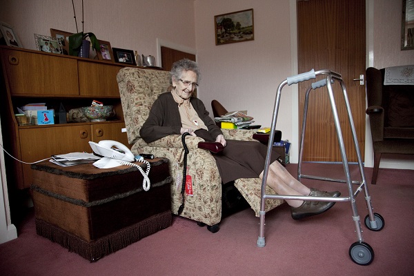
Credit: JRF/Liz Hingley
The Climate Just map tool contains a series of maps which can be used to understand the current patterns of people in poor health across England, Wales and Scotland. Some of the main geographical patterns for England are summarised below. The tool also allows users to overlay maps of potential exposure to flooding and heatwaves. See the map tool for the national maps for 2011 in your area, including updated and refined data on social flood vulnerability and flood disadvantage in England, Scotland and Wales.
The most recent Census suggests that the neighbourhoods with the highest proportion of people whose daily activities are limited a lot by a long term health problem tend to be in the north of England, and on the coast, particularly in the southwest. The neighbourhood in England with the highest proportion was located in East Lindsey (on the East Midlands coast) where 39% of the population reported that their daily activities were limited by a long term health problem or disability. The neighbourhoods with the lowest proportions were predominantly in the south, particularly in the London area. Several of the least affected neighbourhoods were found in Kensington and Chelsea but the neighbourhood with the absolute lowest proportion (3%) was found in Manchester, contrasting with the general tendency for the urban areas of the North to have higher proportions of residents in ill-health.
The distribution of households containing at least one person whose daily activities are limited a lot by a long term health problems shows a similar pattern. In this case the highest proportion was found in a neighbourhood in Barnsley (44%) and the lowest in Leeds (5%).
See the map tool for more information on patterns in Englands, Scotland and Wales.

Built by:
![]()
© 2014 - Climate Just
Contact us